B · The stateful Save button¶
A small, sharp exercise: the Save button with two states from the
vsd-sat-grader app — Trace 2 (FR9) on the class Mock-ups page. Best if
you have done Level 2 — Theming.
The target¶
The same Save button is shown in two states. Look at the wide button at the bottom of each screen:
| Dirty — "To save" (orange, active) | Clean — "Saved" (green, disabled) |
|---|---|
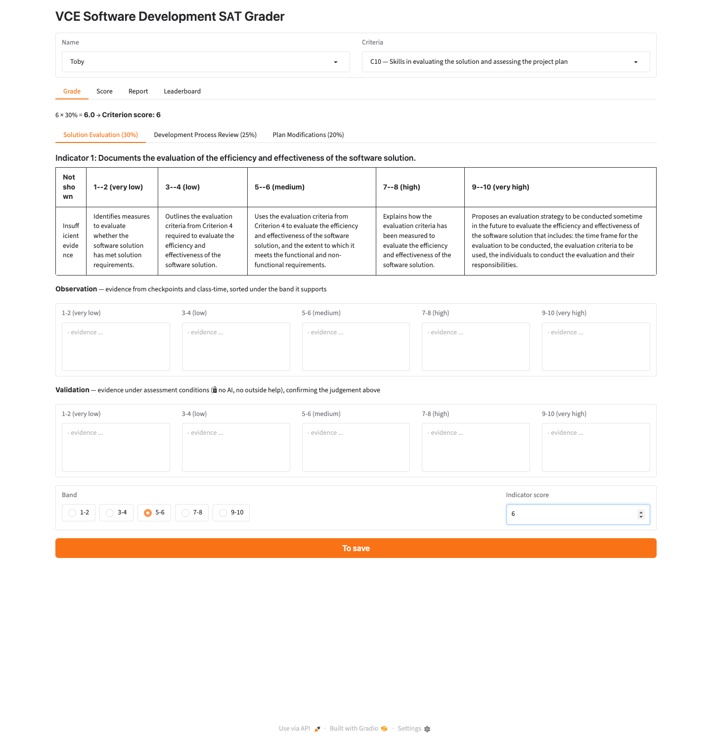 |
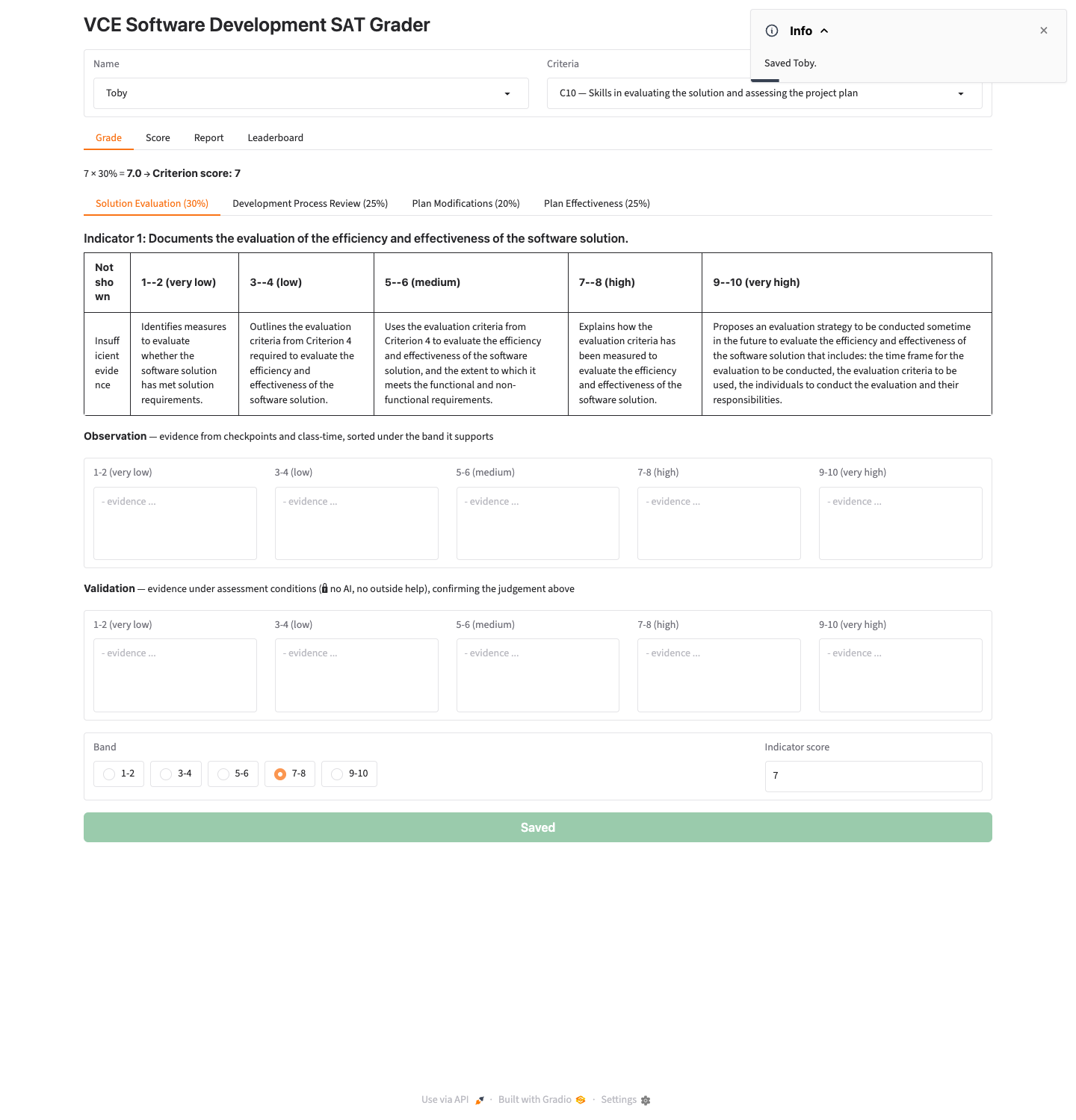 |
Above: the two Save states. Source: class Mock-ups page (vsd-sat-grader).
The requirement (FR9) is: "To save" (orange, enabled) when there are unsaved edits; "Saved" (green, disabled) when everything is saved — green means it is safe to quit.
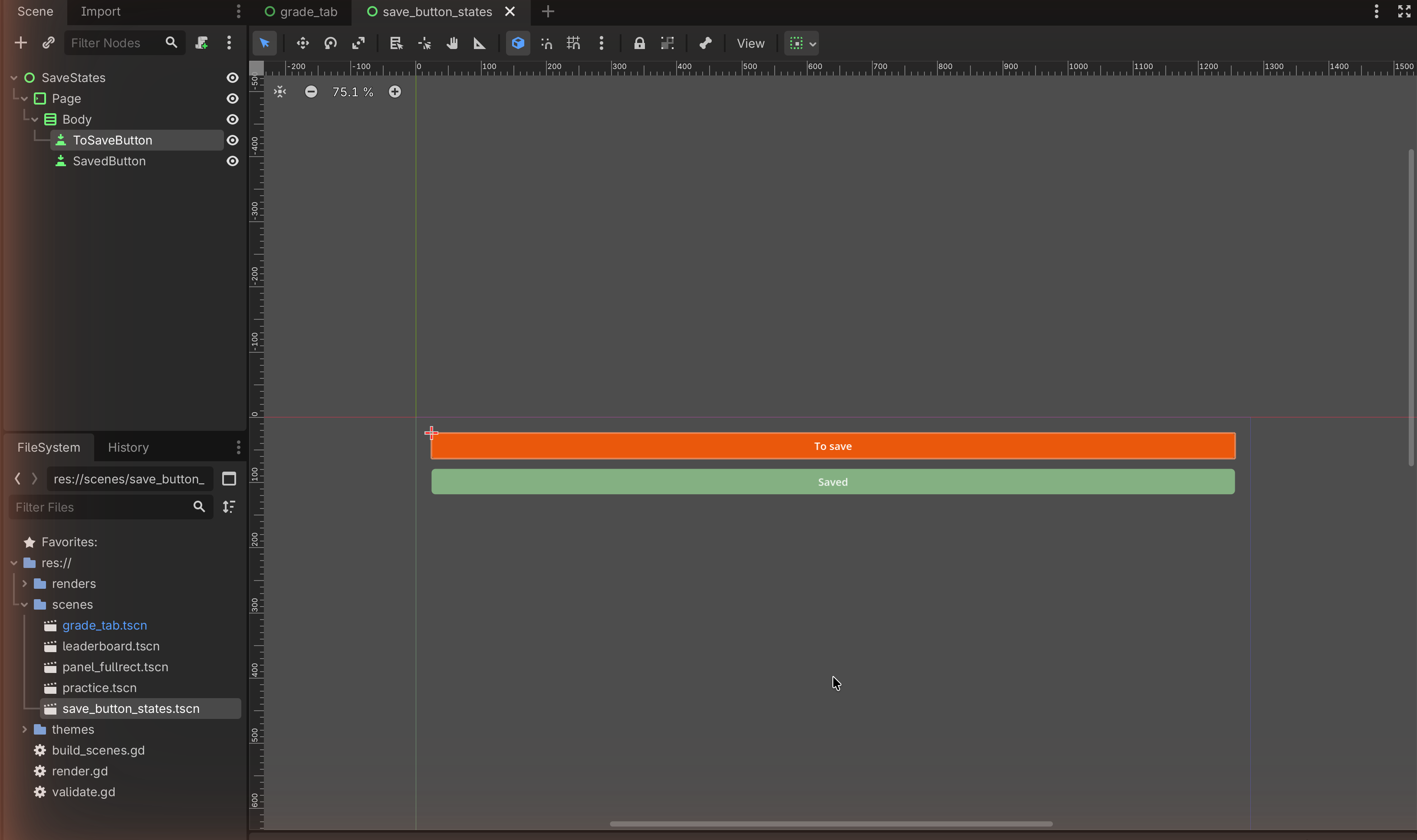
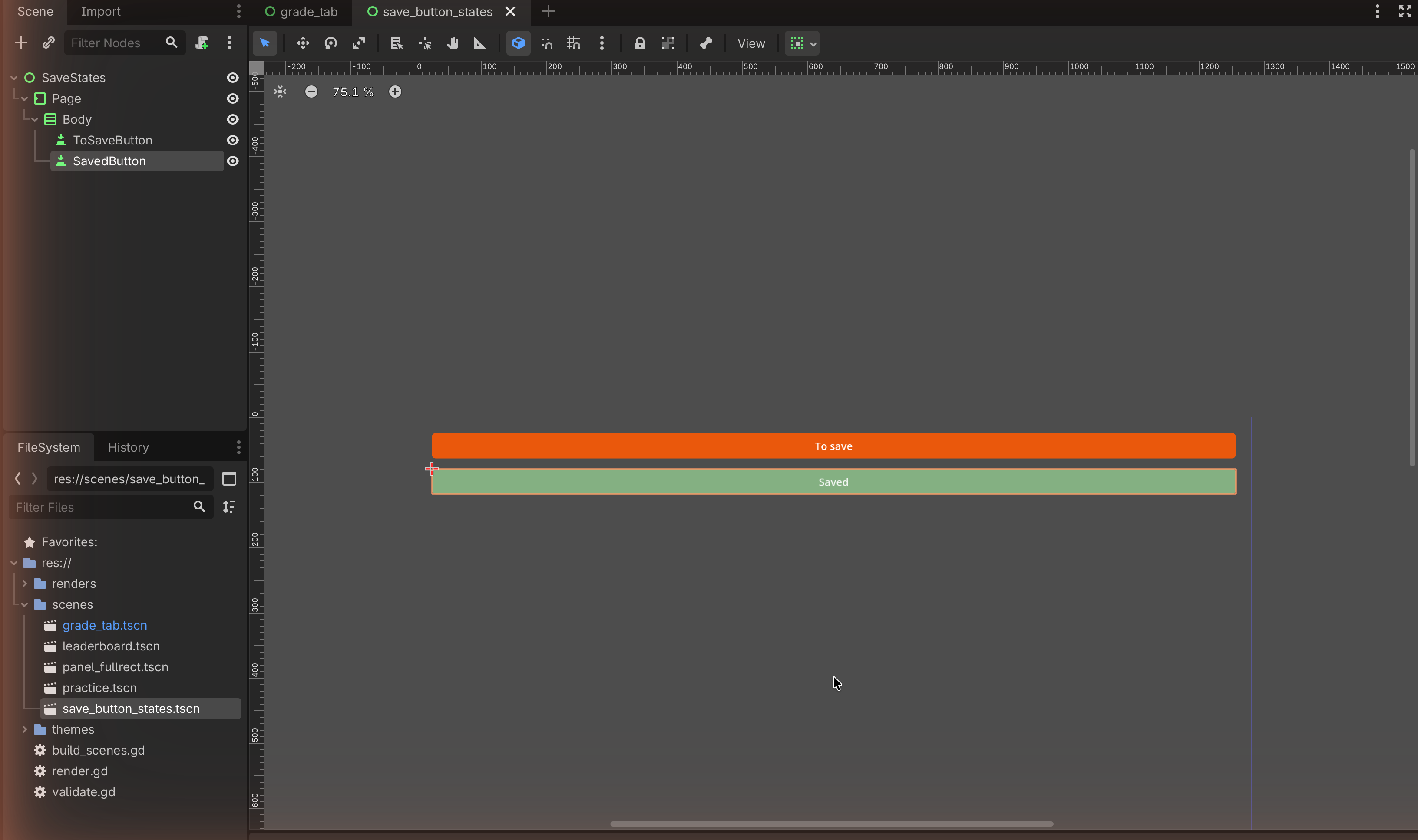
The Godot rebuild — what you're aiming for¶
The two states rebuilt in Godot (dark background is Godot's default theme):
Which UI pattern, and why¶
Pattern: one button design, shown in two StyleBoxFlat colour states, to communicate status through colour.
Why this is a mock-up job, not a coding job:
- What flips the button between the two states (detecting unsaved edits) is behaviour → out of scope. A mock-up never makes it switch.
- What the two states look like is design, and that is what you mock up: two captured images, side by side, each annotated with what the state tells the user.
- The design uses two design ideas worth naming in your annotation: contrast (orange vs green reads as "act" vs "safe") and affordance (the disabled grey-green look signals "nothing to do here").
So you build the button twice — once per state — and capture both.
The node tree¶
Tiny on purpose. Build it twice (or duplicate the button and restyle the copy):
Control                     (root, User Interface, Full Rect)
└── MarginContainer
    └── VBoxContainer
        ├── Button          "To save"   (orange StyleBoxFlat)
        └── Button          "Saved"     (green StyleBoxFlat, greyed text)
Showing both in one scene makes a clean before/after pair for your design sheet.
Build it¶
1 — The "To save" (orange, active) state¶
- Add a Button; set Text to
To save. - Give it the orange StyleBoxFlat from
Level 2 (§2.3): BG Color
#EA580C, Corner Radius ~6, white Font Color. - Turn Container Sizing → Horizontal → Expand+Fill on so it spans the width.
2 — The "Saved" (green, disabled) state¶
- Add a second Button (or duplicate the first with Ctrl+D); set Text
to
Saved. - Give it a green StyleBoxFlat: BG Color
#84B082. - Make it read as disabled: set a muted Font Color (e.g. a soft white or light grey). For an authentic look you can also tick the button's Disabled property — in a mock-up that just shows the greyed state; nothing needs to run.
3 — Capture both states¶
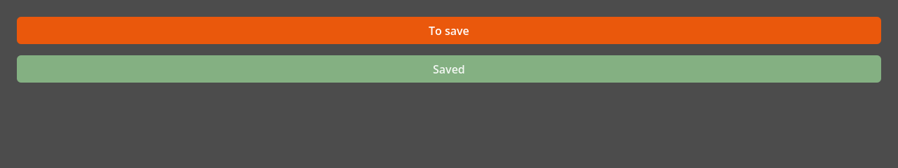
Capture the two buttons (together, or one scene each). On your design sheet, place them side by side and annotate the meaning:
- "To save (orange, active): high contrast marks unsaved work — act now."
- "Saved (green, disabled): the muted, un-clickable look gives affordance — it signals there is nothing to do and it is safe to quit."
Match check¶
This rebuilds the two Save states from Trace 2 (FR9). The switching behaviour is deliberately not built — it is code, and out of scope. The mock-up correctly captures the design of each state, which is what C5-1 assesses.
✋ Done
A focused two-state mock-up with strong annotation material (contrast + affordance). Small, but it shows you can design state, not just a screen.
Image credits¶
Target screenshots from the class Mock-ups page (vsd-sat-grader, © The
Hamilton and Alexandra College). Step screenshots are placeholders to be captured
in our own editor.