A · The Grade tab¶
The full Grade screen of the vsd-sat-grader app — the best single exercise for
everything in Level 1: nested containers, a tab strip,
boxed panels, and a styled action button.
Prerequisites
Level 1 (containers + anchors). The orange Save button at the end uses Level 2 — optional.
The target¶
This is the real screen, from Trace 1 (FR3) on the class Mock-ups page. Rebuild its layout, not its behaviour.
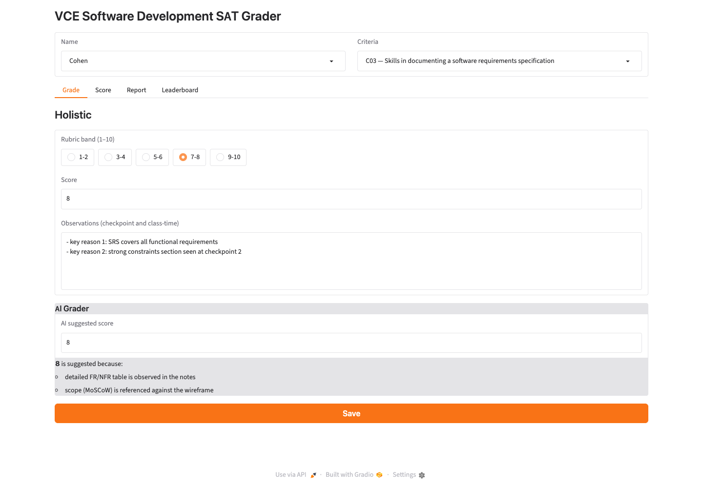
Above: the target screen. Source: class Mock-ups page (vsd-sat-grader).
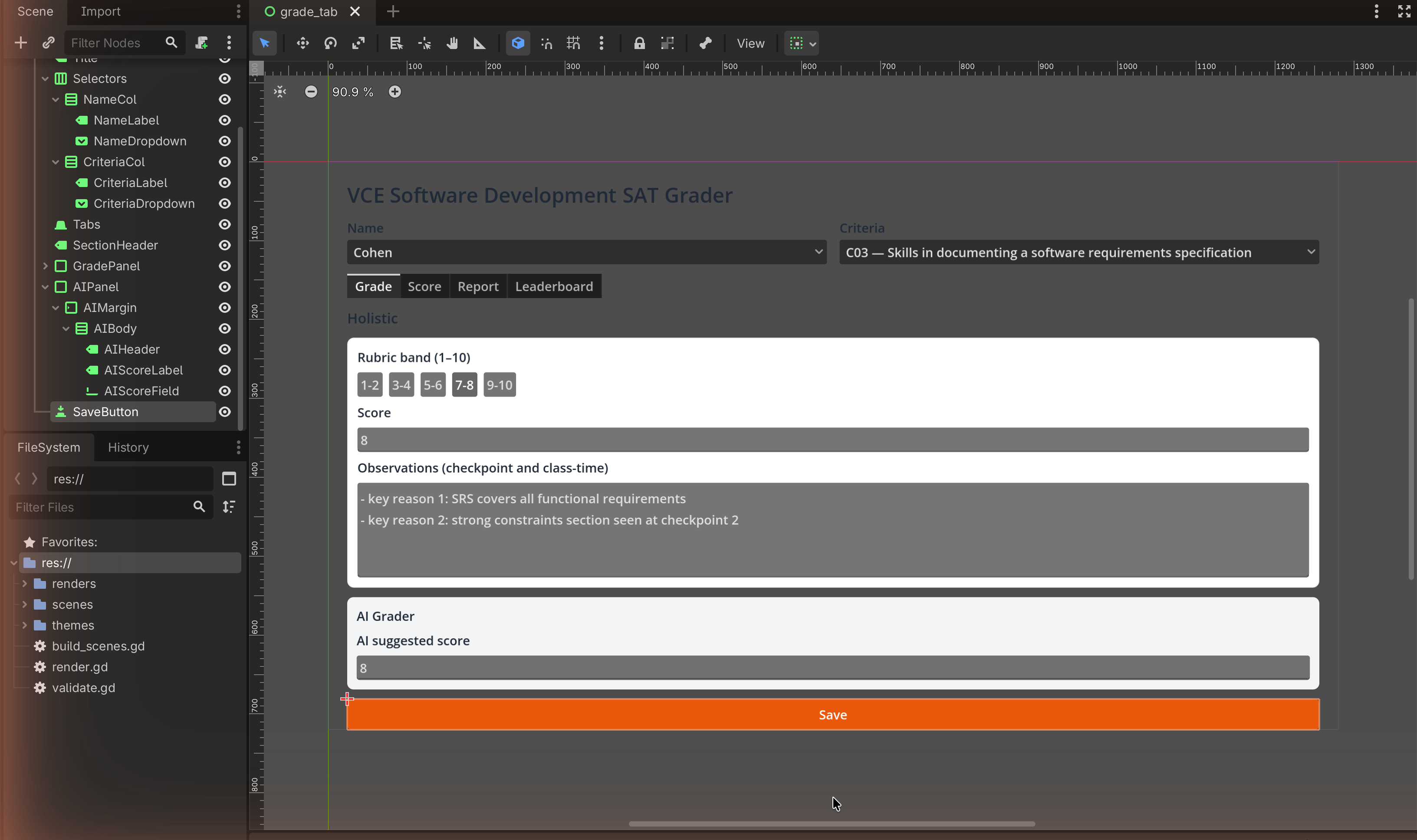
The Godot rebuild — what you're aiming for¶
Here is the same screen rebuilt in Godot — what your layout will look like once you finish this page:
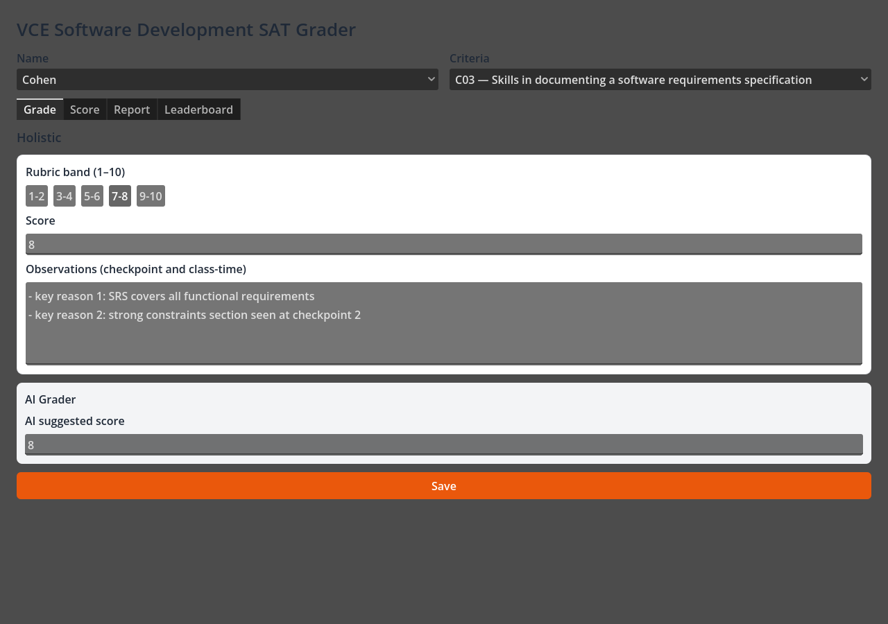
Why it looks dark
Godot's default UI theme is dark, so a freshly-built layout previews on a dark background. That is fine — C5-1 is about the layout, and the house colours (orange Save, white panels) still read clearly. Level 2 shows how to push the styling further.
Which UI pattern, and why¶
Pattern: a vertical page of stacked sections, with a tab strip near the top and each section wrapped in a framed panel.
Why this pattern fits the screen:
- The screen reads top to bottom (title → selectors → tabs → grading panel → AI panel → Save) → a VBoxContainer is the page spine.
- The Name and Criteria selectors sit side by side → an HBoxContainer row.
- The rubric bands are a single row of choices (1-2 … 9-10) → an HBoxContainer of buttons.
- The grading section and the AI section are visually boxed groups → PanelContainer (with a MarginContainer inside for breathing room).
- This is exactly the containers-for-everything approach from Level 1, which is what makes the design feasible and complete — it would resize cleanly and could really be built.
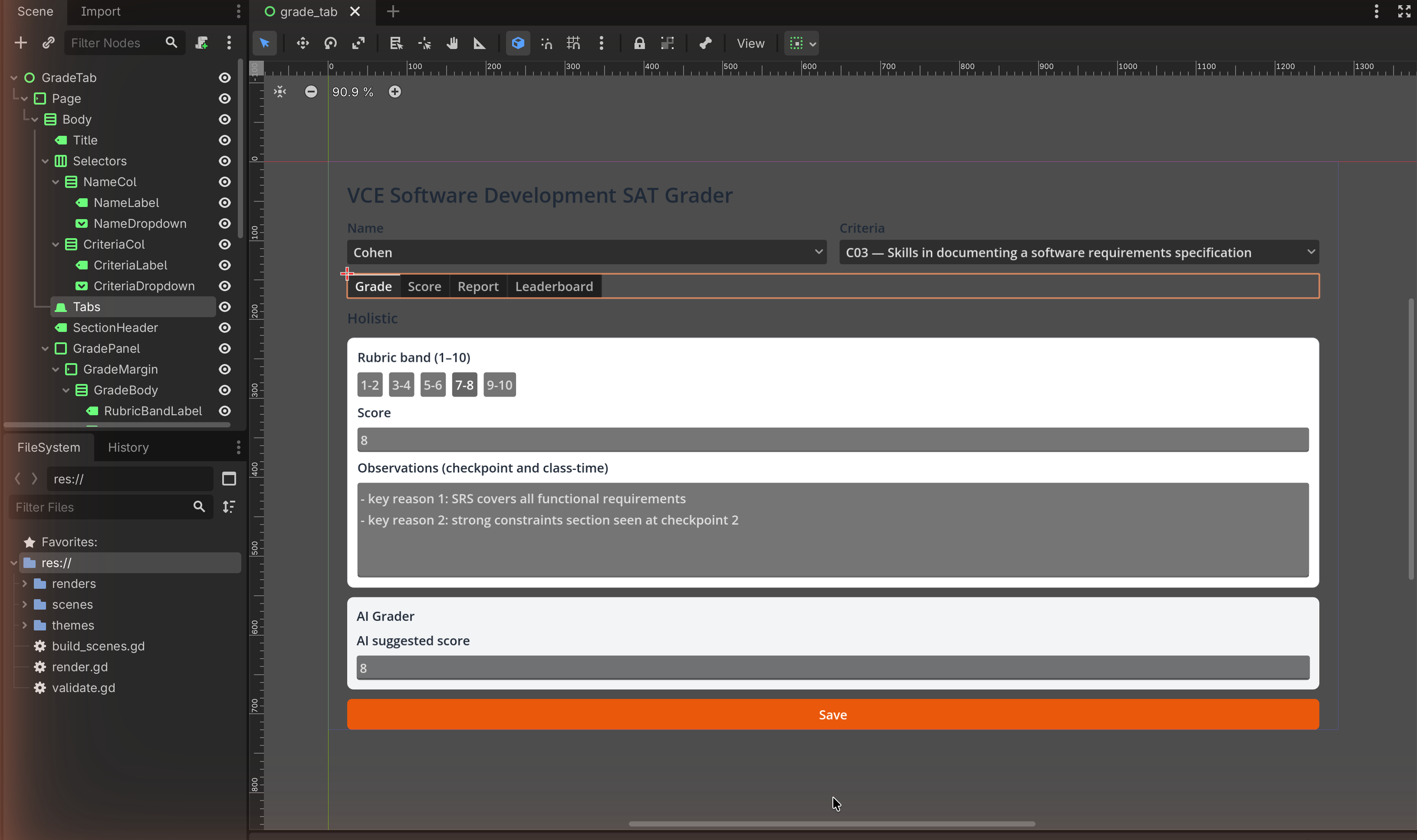
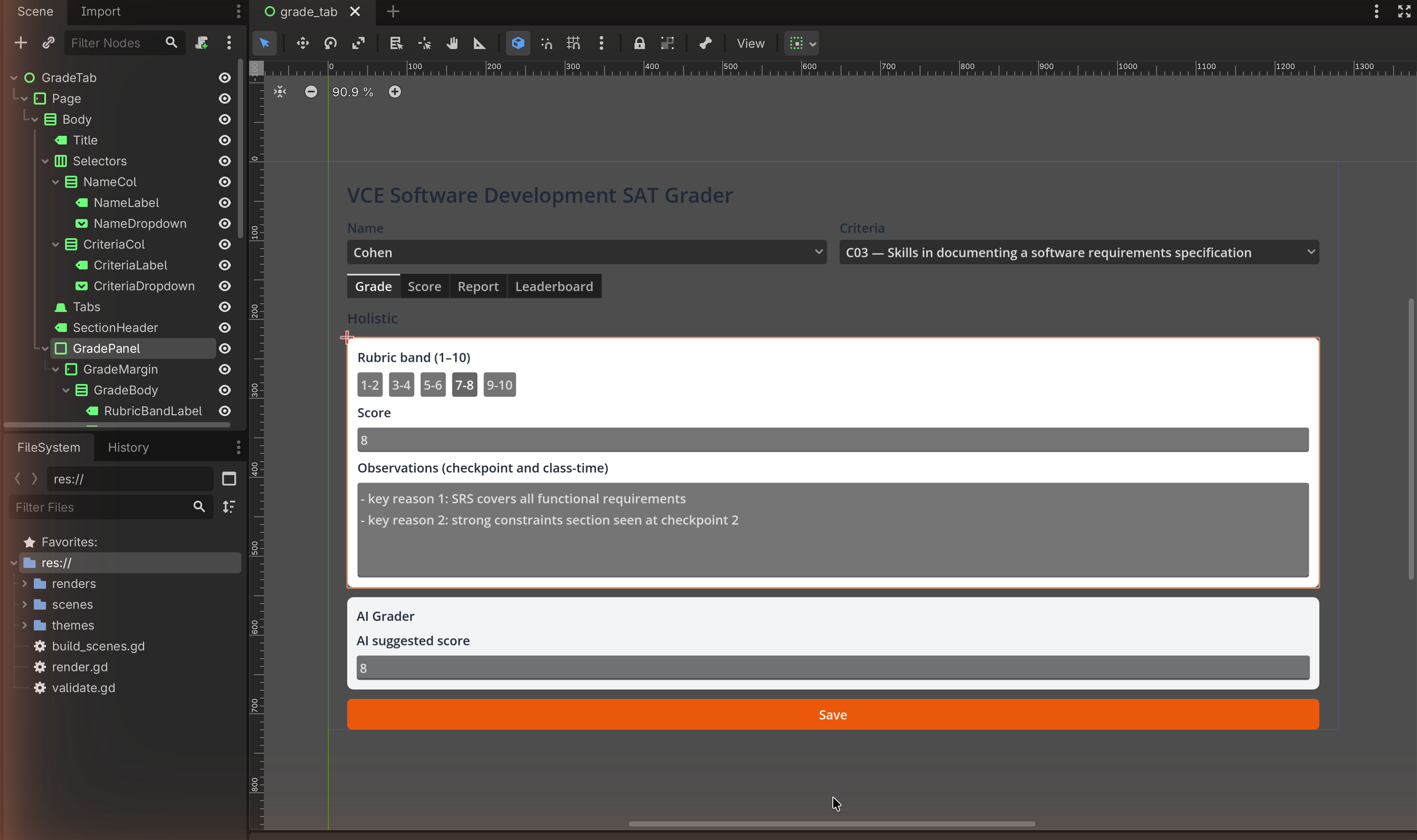
The node tree¶
Read this as your Scene dock. Indentation = parent → child.
Control                         (root, User Interface, Full Rect)
└── MarginContainer             (page padding)
    └── VBoxContainer           (the page, top → bottom)
        ├── Label               "VCE Software Development SAT Grader"  (title)
        ├── HBoxContainer       (the selectors row)
        │   ├── VBoxContainer
        │   │   ├── Label        "Name"
        │   │   └── OptionButton (the dropdown)
        │   └── VBoxContainer
        │       ├── Label        "Criteria"
        │       └── OptionButton
        ├── TabBar              (Grade | Score | Report | Leaderboard)
        ├── Label               "Holistic"   (section header)
        ├── PanelContainer      (the grading box)
        │   └── MarginContainer
        │       └── VBoxContainer
        │           ├── Label            "Rubric band (1–10)"
        │           ├── HBoxContainer    (the band buttons)
        │           │   ├── Button  "1-2"
        │           │   ├── Button  "3-4"
        │           │   ├── Button  "5-6"
        │           │   ├── Button  "7-8"
        │           │   └── Button  "9-10"
        │           ├── Label            "Score"
        │           ├── LineEdit         (one-line number field)
        │           ├── Label            "Observations (checkpoint and class-time)"
        │           └── TextEdit         (multi-line box)
        ├── PanelContainer      (the "AI Grader" box)
        │   └── MarginContainer
        │       └── VBoxContainer
        │           ├── Label     "AI Grader"
        │           ├── Label     "AI suggested score"
        │           └── LineEdit
        └── Button              "Save"   (wide, orange — Level 2)
Build it¶
New control: OptionButton
An OptionButton is the dropdown Control — a button that opens a list of choices. It is the right node for the Name and Criteria selectors. (For a mock-up you can leave its list empty or add a couple of items in the Inspector's Items array; you do not need code.)
1 — Page frame¶
- Root is your User Interface Control (from Level 0). Set it to Full Rect.
- Add a MarginContainer child; add a VBoxContainer inside it. Give the
MarginContainer a margin (Theme Overrides) of ~
24.

2 — Title¶
Add a Label as the first child of the VBox; set Text to
VCE Software Development SAT Grader. Bump its Font Size (Theme Overrides).

3 — The Name / Criteria row¶
- Add an HBoxContainer to the VBox.
- Inside it add two VBoxContainers.
- In the first: a Label
Name+ an OptionButton. In the second: a LabelCriteria+ an OptionButton. - On each OptionButton, turn Container Sizing → Horizontal → Expand on so the two share the row evenly.

4 — The tab strip¶
Add a TabBar to the VBox. In the Inspector, add tabs named Grade, Score, Report, Leaderboard (the Tabs property / the small + in the TabBar's Inspector).
TabBar vs TabContainer
A TabBar is just the strip of tab buttons — perfect for a mock-up, because it shows the tabs without needing code to switch content. A TabContainer actually swaps a different child per tab (you'll use that in layout C). For this screen the strip is all you need.
5 — The "Holistic" grading panel¶
- Add a Label
Holisticto the VBox. - Add a PanelContainer; inside it a MarginContainer; inside that a VBoxContainer. This is your boxed section.
- In that inner VBox add, in order:
- Label
Rubric band (1–10). - an HBoxContainer with five Buttons:
1-2,3-4,5-6,7-8,9-10. - Label
Score, then a LineEdit. - Label
Observations (checkpoint and class-time), then a TextEdit (multi-line). Give the TextEdit a Custom Minimum Size height so it shows as a box.
- Label
6 — The AI Grader panel¶
Add a second PanelContainer → MarginContainer → VBoxContainer with a Label
AI Grader, a Label AI suggested score, and a LineEdit. (In the real app
this box is greyed; you can give its panel a light-grey StyleBoxFlat from
Level 2.)

7 — The orange Save button¶
Add a Button at the bottom of the page VBox, Text Save, with
Container Sizing → Horizontal → Expand+Fill so it spans the width. Style it
with the orange StyleBoxFlat from
Level 2 — Theming (§2.3: #EA580C, white text, rounded
corners).
Match check¶
This rebuilds the Grade tab from Trace 1 (FR3) on the Mock-ups page — title, Name/Criteria selectors, the four-tab strip, the rubric band row, score + observations, the AI panel, and the orange Save button. It does not reproduce design correction 01 (the rubric-descriptor accordion); add an accordion only if you want extra practice — Godot's equivalent is nesting a panel under a button-toggled section, and it is not required.
✋ Done
Capture it and annotate each control with what it does and why it sits where it does. That is a complete worked mock-up.
Image credits¶
Target screenshot from the class Mock-ups page (vsd-sat-grader, © The
Hamilton and Alexandra College). Step screenshots are placeholders to be captured
in our own editor.