C · The Leaderboard
The trickiest worked layout — the leaderboard from Trace 3 (FR6) on the class Mock-ups page. Pick this if you want to practise sub-tabs and a grid "table".
Missing asset — flagged
Unlike the Grade tab and the Save button, the wiki Mock-ups page has no screenshot of the leaderboard. FR6 is traced in words only: it is a Could-have, was not in the C04 wireframe, and reached a built design via design correction 08, which "moved one table off the Score tab and split the Leaderboard into two sub-tabs." That written description is all the source gives, so this page rebuilds from it and uses placeholders for the target. Designing from a description rather than a picture is a normal, real-world situation.
What the source actually specifies
From the Mock-ups page (Trace 3) and design correction 08, the leaderboard:
- ranks students by total score across the cohort (FR6);
- was split into two sub-tabs (correction 08) because a single rank-list did not serve the user's task well;
- involves a table that was moved off the Score tab.
What it does not specify (so you choose, and note your choice in your design log): the exact column set of each table and the exact names of the two sub-tabs. List these as assumptions on your sheet.
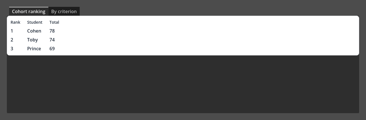
Above: a Godot reconstruction of the two-sub-tab leaderboard — no wiki screenshot exists, so this is built from the written description. Godot's default theme is dark; the layout is the point.
Which UI pattern, and why
Pattern: a TabContainer (two sub-tabs) wrapping a grid "table" on each tab.
Why this pattern:
- Correction 08's whole point is two sub-tabs that show different content → a TabContainer, which swaps a different child node per tab (this is the step up from the Grade tab's TabBar, which only shows the strip).
- A ranking table with aligned columns, with no code, is a
GridContainer of Labels: set Columns to your column count and add
one Label per cell. (Godot's
Tree/ItemListwould need code to fill — out of scope — so the grid-of-labels is the feasible mock-up choice.)
New container: TabContainer
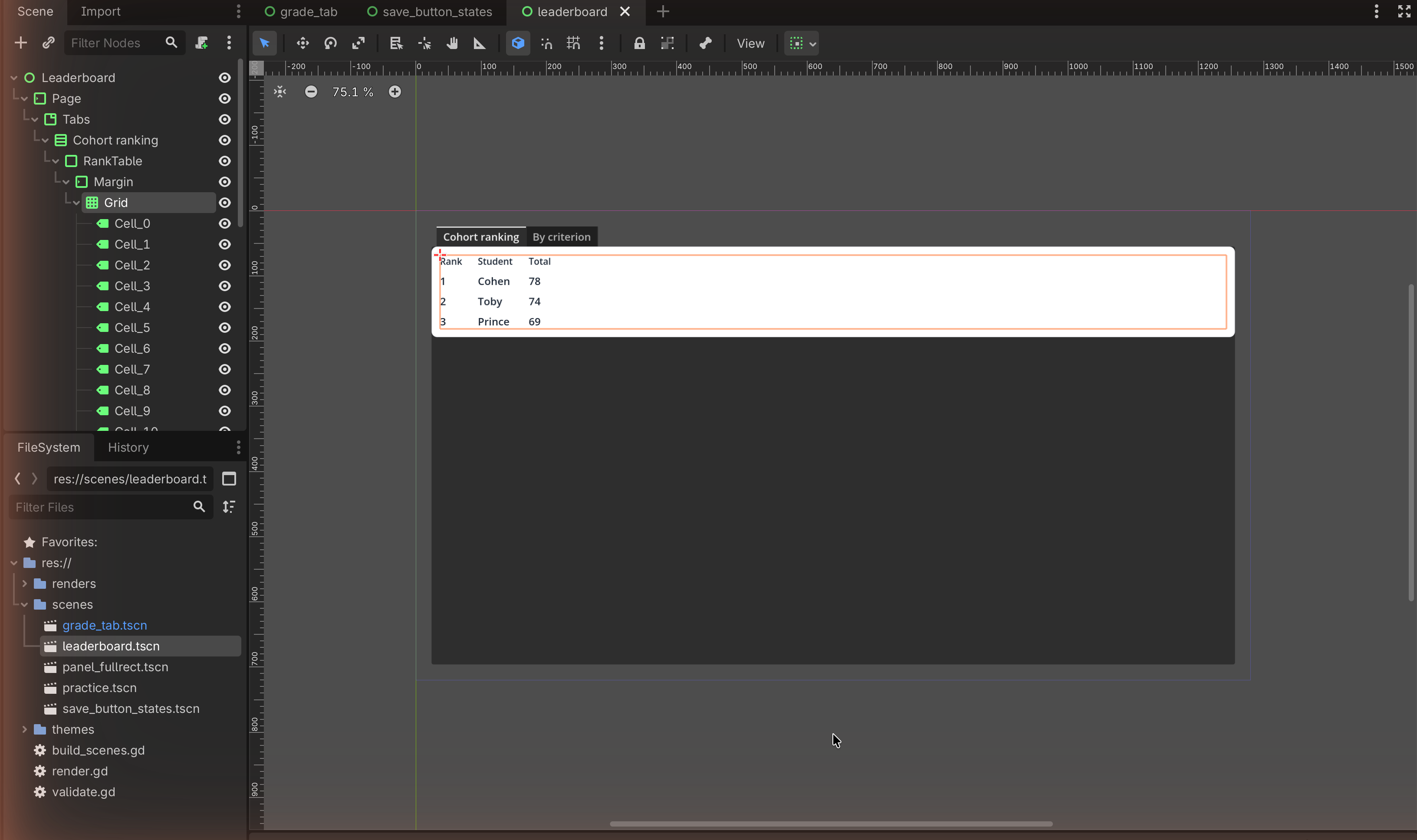
A TabContainer shows one child node per tab and draws the tab strip automatically — each direct child becomes a tab, named after that child node. Rename the child nodes to name the tabs.
The node tree
Control                         (root, User Interface, Full Rect)
└── MarginContainer
    └── TabContainer            (the two sub-tabs)
        ├── VBoxContainer  "Cohort ranking"     (child → tab 1)
        │   └── PanelContainer
        │       └── MarginContainer
        │           └── GridContainer  (Columns = 3)
        │               ├── Label "Rank"   ├── Label "Student"  ├── Label "Total"
        │               ├── Label "1"      ├── Label "…"        ├── Label "…"
        │               └── … (one Label per cell, row by row)
        └── VBoxContainer  "By criterion"       (child → tab 2)
            └── PanelContainer
                └── MarginContainer
                    └── GridContainer  (Columns = your choice)
                        └── … (Label per cell)
(“Cohort ranking” and “By criterion” are example sub-tab names — pick your own and record them as assumptions.)
Build it
1 — The two sub-tabs
- Root User Interface Control → Full Rect.
- Add a MarginContainer, then a TabContainer inside it.
- Add two VBoxContainer children to the TabContainer. Rename them — the
tab labels come from the node names (e.g.
Cohort ranking,By criterion). Click the tabs at the top of the TabContainer to switch between them.
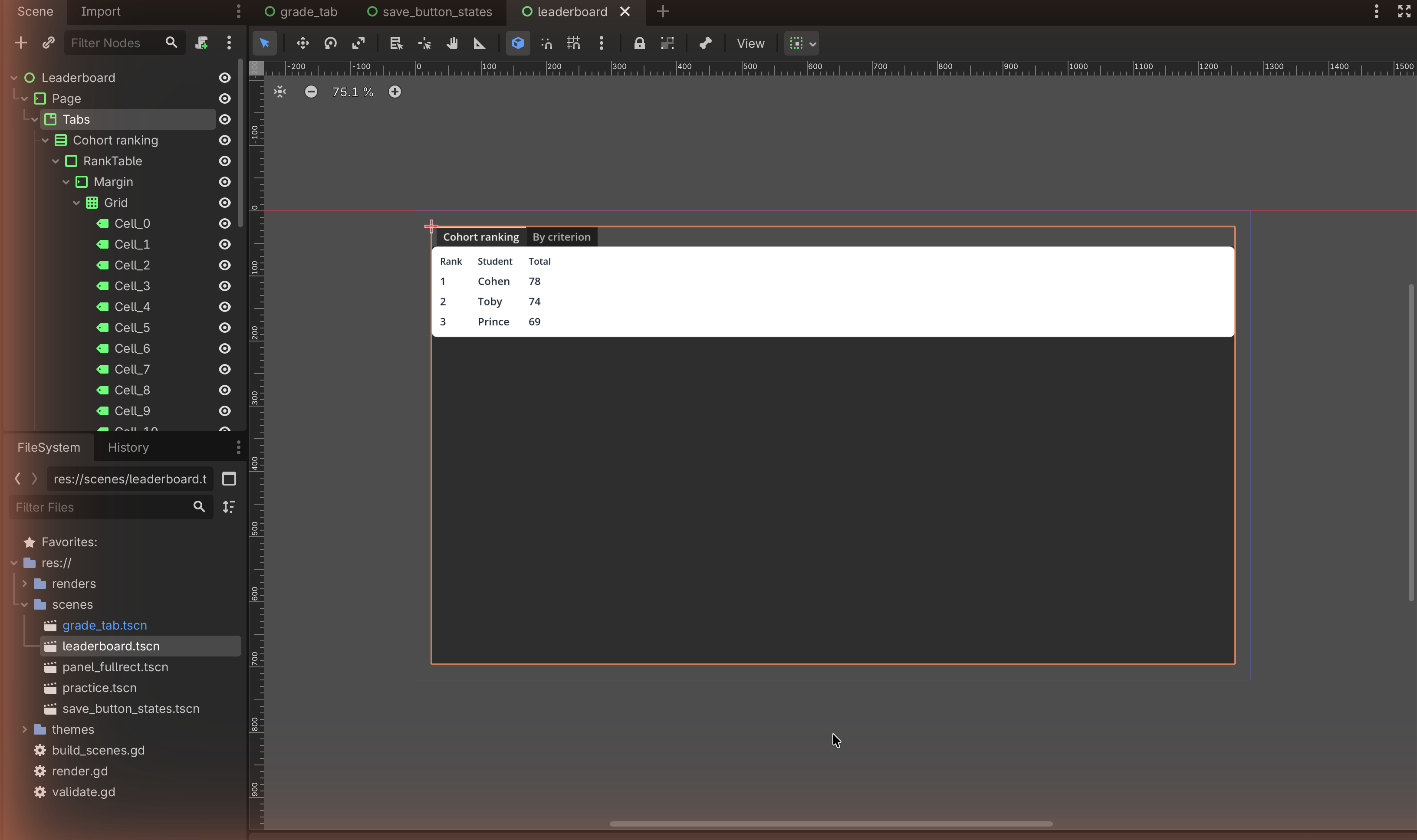
2 — A grid "table" on tab 1
- On the first sub-tab's VBox, add a PanelContainer → MarginContainer → GridContainer.
- Set the GridContainer's Columns to your column count (e.g.
3). - Add Labels cell by cell: header row
Rank,Student,Total, then a few data rows. Because Columns = 3, every third Label starts a new row automatically.
3 — A second table on tab 2
Switch to the second sub-tab and repeat with whatever columns suit your "by criterion" view. Keep the two tables visually consistent (same panel, same margins) so the split reads as one feature.

Match check
This rebuilds FR6's leaderboard as design correction 08 describes it — two sub-tabs, each a table — since no wiki screenshot exists. Note on your sheet: (a) that you designed from the written correction, not an image, and (b) your assumed sub-tab names and columns. Naming the missing-asset gap honestly is exactly what Trace 3 on the Mock-ups page asks you to do.
✋ Done
Capture both sub-tabs and annotate why the split serves the user better than one long list (the reason correction 08 exists).
Image credits
No target screenshot exists on the wiki for this layout; the placeholders mark where your own reconstruction capture will go. Pattern derived from the written FR6 trace on the class Mock-ups page.