Level 2 — Theming & polish (optional)
Raw Godot controls are grey and generic. A C05 mock-up has to be high-fidelity — real colours, real fonts — so a marker sees what the finished screen will look like, not a wireframe. This level adds that polish with two tools: StyleBoxFlat (style one node) and Theme (style everything at once).
Prerequisite
This level assumes Level 1: you can add Control nodes, use containers, and find properties in the Inspector. Everything here is still Inspector actions only — no code.
2.1 — The house colours
We will style towards the SAT-grader house colours (the real app the worked layouts come from). Use these exact values so your mock-up matches the rest of the project:
| Role | Colour | Hex |
|---|---|---|
| Primary action (Save / "To save") | orange | #EA580C |
| Clean / safe ("Saved", disabled) | green | #84B082 |
| Body text | slate | #1F2937 |
| Panel fill | light grey | #F3F4F6 |
| Panel border | grey | #E5E7EB |
In Godot's colour picker you can paste the hex (without or with the #) straight
into the Hex field.
2.2 — A quick win: override one colour
The fastest polish is a theme override — a property that changes the look of one node only.
- Select a Button.
- In the Inspector, expand Theme Overrides.
- Open Colors → set Font Color (e.g. white for an orange button).
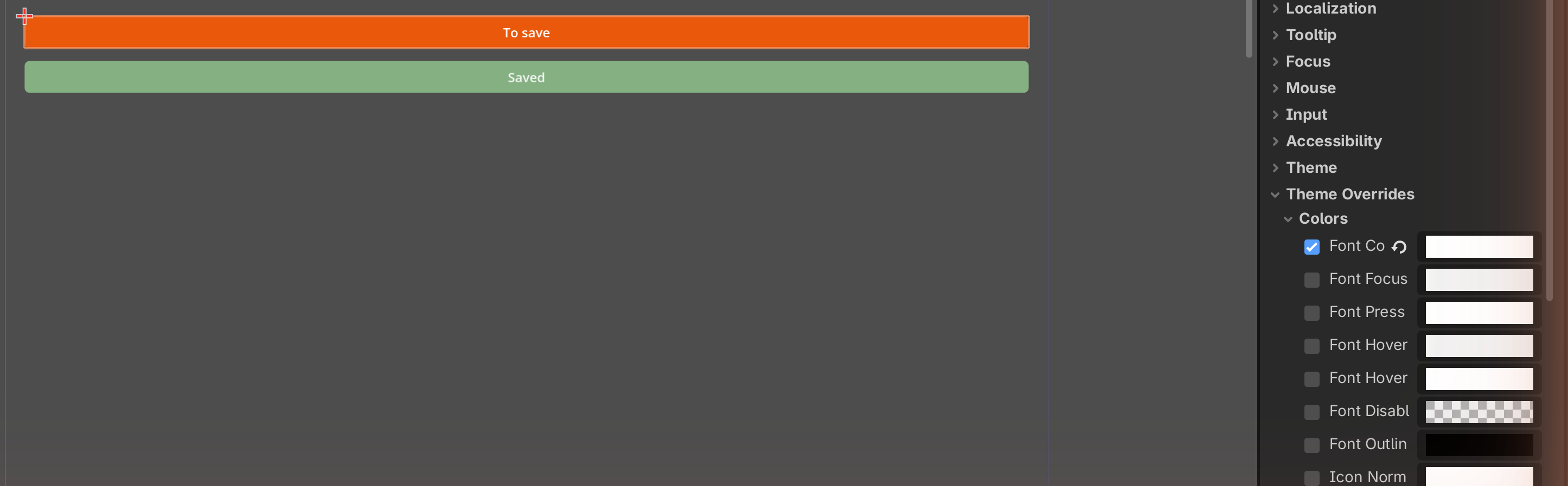
Theme overrides are quick but they only affect that single node. For a coloured box — a real button background — you need a StyleBoxFlat.
2.3 — StyleBoxFlat: make the orange Save button
A StyleBoxFlat is a small reusable resource that draws a flat coloured box: a fill colour, rounded corners, a border, and inner padding. It is how you turn a plain button into the orange Save button from the app.
- Select your Button.
- Inspector → Theme Overrides → Styles → click the Normal slot → New StyleBoxFlat.
- Click the StyleBoxFlat to expand its properties, then set:
- BG Color →
#EA580C(the house orange). - Corner Radius (all four) → e.g.
6. - Content Margin (left/right/top/bottom) → e.g.
12/8so the label has breathing room.
- BG Color →
- Set the button's Text to
Save, and (from 2.2) Font Color to white.
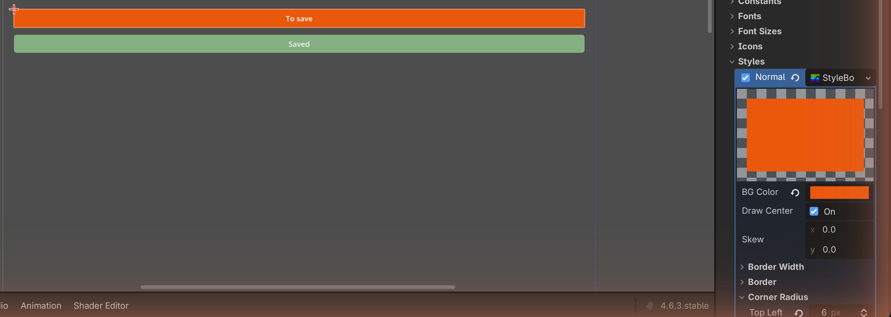
That is the orange Save button from
the worked Grade tab. For the green "Saved" state,
make a second StyleBoxFlat with BG Color #84B082 — see
the stateful Save button.
Buttons have several style slots
A Button has Normal, Hover, Pressed, and Disabled style slots. For a mock-up you usually only need Normal (and maybe Disabled for a greyed-out look). You do not need to fill them all.
✓ Check you can do this
You can give a Button a coloured background with rounded corners using a StyleBoxFlat, and paste a house hex into the colour picker.
2.4 — Theme resources: style everything at once
Styling every node by hand is slow and inconsistent. A Theme is a single resource that holds default styles for many node types; assign it once and every matching control follows it.
- Select your root Control.
- Inspector → Theme → Theme slot → New Theme.
- Click the new Theme to open the Theme editor (bottom panel).
- In the Theme editor you can add a type (e.g. Button) and set its default colours and StyleBoxes — now every button in the scene uses them.
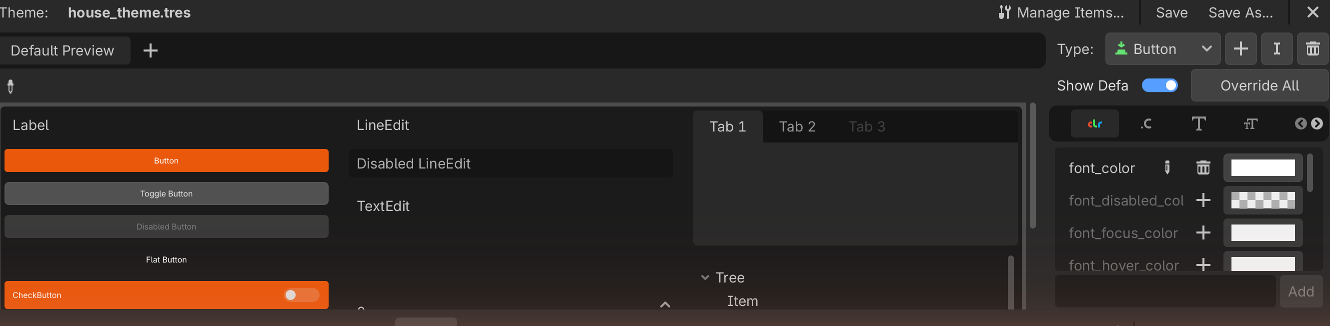
How far to go
For a mock-up, a Theme is optional polish. Many strong mock-ups just style the few buttons and panels that matter with StyleBoxFlat overrides. Use a Theme only if you have many controls and want them perfectly consistent.
2.5 — Fonts and spacing (the cheap polish)
Two more touches lift fidelity a lot:
- Font size — Label/Button → Theme Overrides → Font Sizes to make a title large and section headers medium. (Custom font files are possible but optional; the default font is fine for a mock-up.)
- Spacing — give containers a separation (Theme Overrides) and wrap sections in a MarginContainer. Space is itself a design principle and makes the screen read as "finished."
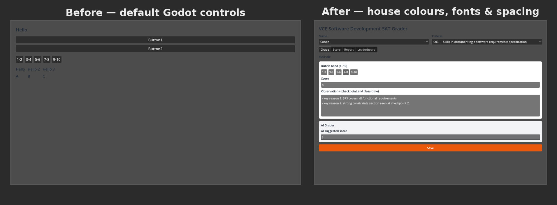
✋ You can stop here
Your mock-up now has real colours, rounded buttons, and tidy spacing — high-fidelity, the way C05 wants it. When you are ready to submit, go to Level 3 — Capturing your mock-up.
Check Your Understanding
-
What is the difference between a theme override and a StyleBoxFlat?
Answer
A theme override changes one property of one node (e.g. its font colour). A StyleBoxFlat is a reusable resource that draws a whole coloured box (fill, corners, border, padding) — it is what gives a button a real coloured background.
-
You want every button in your mock-up to look identical without styling each one. What do you use?
Answer
A Theme resource, assigned to the root, with a default Button style set in the Theme editor.
-
Which house colour is the primary action, and where would you use it?
Answer
Orange
#EA580C— on the main action button, e.g. Save.
Image credits
Screenshots on this page are placeholders to be captured in our own editor. The house colours are taken from the SAT-grader project (see Worked layouts).