Level 1 — Foundations
This is the independence threshold. When you finish this page you will know the handful of ideas every Godot UI tutorial assumes you already have: the right kind of node, the two ways to position it, the containers that arrange it, and how to find any property in the Inspector. After that you can open an arbitrary YouTube tutorial or the Godot docs and follow along on your own.
We still move one concept at a time. Each new word is defined the first time it appears.
Recap from Level 0
You can already: add a node, select it, set a property in the Inspector, save, and preview. Level 1 is those same moves used to build real layouts.
1.1 — Control nodes vs Node2D
Open the Create New Node dialog again (select a node → +). Notice the two big families near the top of the list:
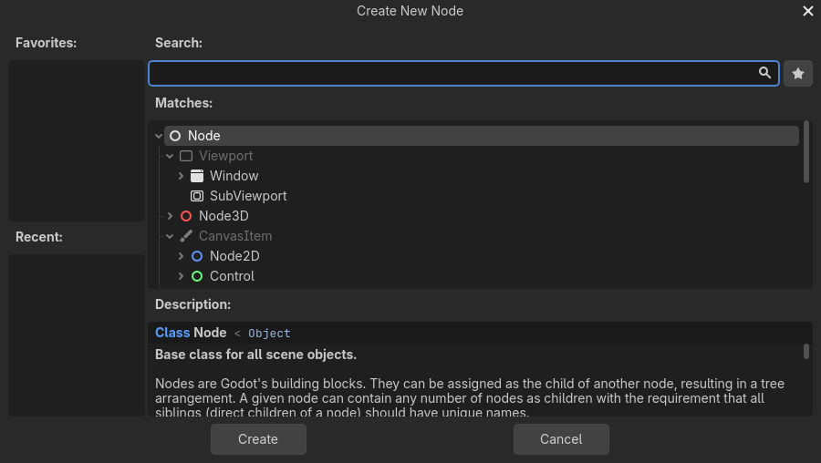
Above: Node2D (blue) and Control (green) are two different families. Image: Godot documentation, CC BY 4.0.
- A Node2D is for 2D game objects — sprites, characters, things you place by free x/y coordinates. Its icon is blue.
- A Control is for user interfaces — buttons, labels, panels, anything that lays out on a screen. Its icon is green.
The one rule for mock-ups
Your mock-up is built entirely from Control nodes (green icons). Anchors and containers — the whole rest of this page — only work on Control nodes. If a node has a blue icon, it is the wrong family for a UI mock-up.
Common Control nodes you will use: Label (text), Button, LineEdit (one-line text box), TextEdit (multi-line box), Panel, TabBar, and the container Controls (next).
✓ Check you can do this
In the Create New Node dialog, you can tell a Control (green) from a Node2D (blue) at a glance, and you know which one a mock-up uses.
1.2 — The two ways to position a Control
There are exactly two ways to decide where a Control sits. Every layout uses one or the other for each node:
| Way | You do | Best for |
|---|---|---|
| Anchors & offsets | pin the node to the parent yourself (manual) | the top-level screen; things that must fill or stick to a corner |
| Containers | drop the node into a container that arranges it for you (automatic) | rows, columns, grids, forms — i.e. most of a real screen |
Learn anchors first (1.3), then containers (1.4). In practice you use a few anchors at the top and containers for everything inside.
1.3 — Anchors and offsets
An anchor is a point on the parent that an edge of your Control is pinned to. Anchors are measured 0 → 1: 0 = left/top edge of the parent, 1 = right/bottom edge.
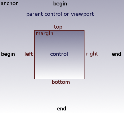
Above: each edge is pinned to an anchor on the parent; the gap from the anchor to the edge is the offset. Image: Godot documentation, CC BY 4.0.
The gap between an anchor and the node's actual edge is the offset.
Version word-swap (you will hit this in tutorials)
The diagram above (from the docs) labels that gap “margin.” That is the Godot 3 name. In Godot 4 the same thing is called the offset. If an older tutorial says "set the margin," read it as "set the offset." This is the single most common word-change between Godot 3 and 4 tutorials.
Anchor presets — the fast way
You rarely type anchor numbers. Instead you use anchor presets from the toolbar above the viewport (visible only when a Control is selected):
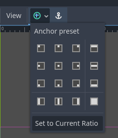
Above: the Anchor preset menu. Image: Godot documentation, CC BY 4.0.
The presets you will actually use:
- Full Rect — the node fills the whole parent. Use this on the panel or container that holds your entire screen.
- Center — keeps the node centred.
- Top Wide / Bottom Wide — stretch across the top or bottom (good for a title bar or a bottom button strip).
- the corner presets — pin to a corner.
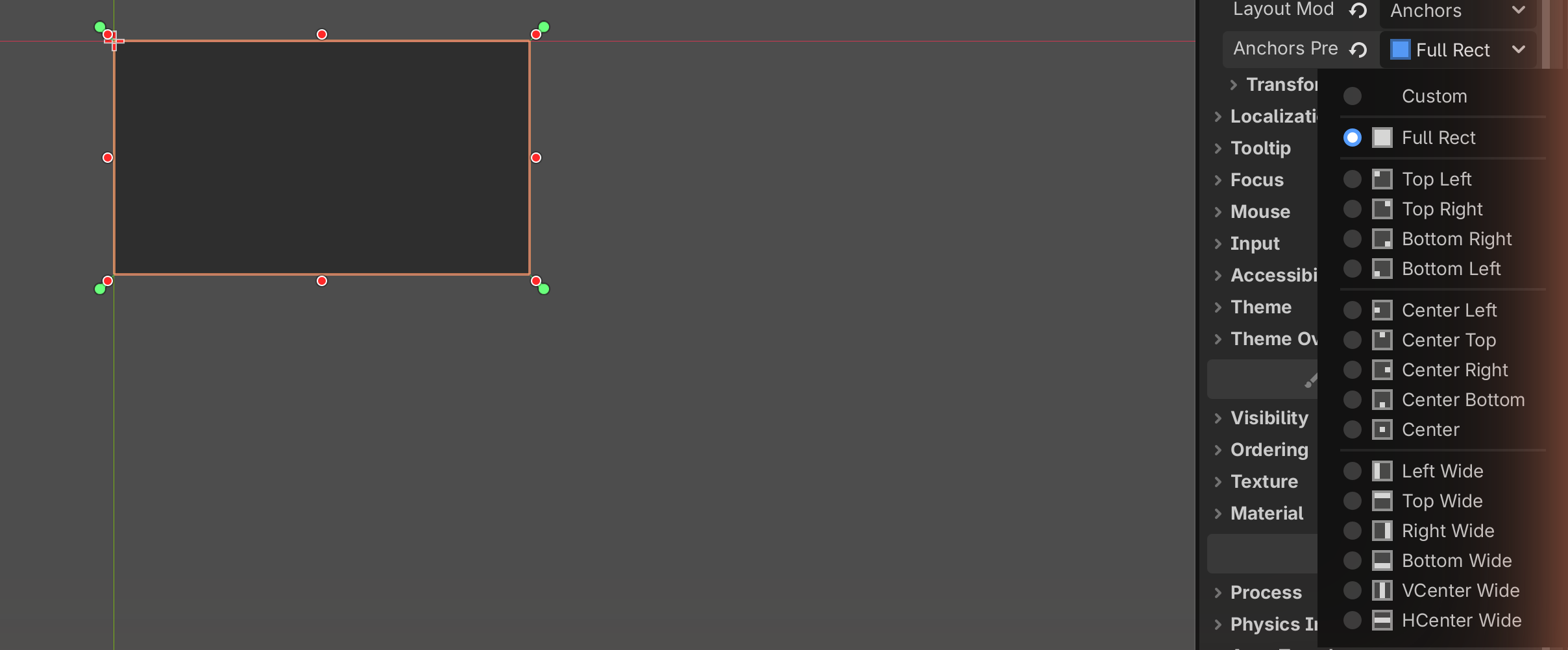
Try it
- Add a Panel as a child of your root Control.
- With the Panel selected, open the Anchor preset menu → click Full Rect.
- The Panel now fills the whole screen, and stays filling it if you resize the preview window. That is anchors doing their job.
✓ Check you can do this
You can pick a Control and set it to Full Rect so it fills its parent. You know that the gap from anchor to edge is the offset (a.k.a. "margin" in old tutorials).
1.4 — Containers: let Godot arrange things for you
A container is a special Control that positions its children for you. You stop dragging nodes around; you drop them inside the container and it lines them up automatically.
The container rule
A child inside a container has its position controlled by the container. So you do not set anchors/offsets on that child — you let the container place it, and adjust spacing with the container's properties and the child's size flags (see 1.5). This trips up everyone once; now you know.
There are five containers you need for a mock-up:
VBoxContainer — a vertical stack
Children are stacked top to bottom. Perfect for a column of fields or a menu.
HBoxContainer — a horizontal row
Children are placed left to right. Perfect for a row of buttons or a toolbar.
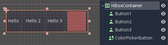
Above: an HBoxContainer lays its children out in a row automatically. Image: Godot documentation, CC BY 4.0.
GridContainer — a grid of N columns
Children wrap into a grid. Set the Columns property (in the Inspector) to choose how many across; children flow onto the next row automatically.
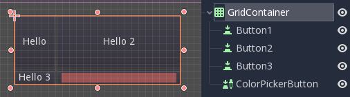
Above: a GridContainer with its Columns set; children wrap to the next row. Image: Godot documentation, CC BY 4.0.
PanelContainer — a framed box around its child
Draws a panel background behind whatever you put inside it. Use it to group things into a visible card or box. It holds one child (usually a VBox).
MarginContainer — breathing room
Adds empty space (margins) around its child, so content does not touch the edges. This is how you get the space design principle into a tidy layout.
The five at a glance
| Container | Arranges children… | Reach for it when you want… |
|---|---|---|
| VBoxContainer | in a vertical stack | a column: a form, a menu, a page |
| HBoxContainer | in a horizontal row | a row: buttons, a toolbar, label + field |
| GridContainer | wrapped into N columns | a grid: a keypad, a gallery, band buttons |
| PanelContainer | one child, with a background | a visible card / boxed group |
| MarginContainer | one child, with padding | space around a section |
Try it
- Add a VBoxContainer as a child of your root.
- Add two Button nodes as children of the VBoxContainer.
- They stack vertically with no dragging. Now change the VBox to an HBoxContainer instead (delete it and add an HBox, or add a new one) and add two buttons — they sit in a row.
Nesting: how real screens are built
The real skill is putting containers inside containers. Almost every screen is a VBox of rows, where some rows are HBoxes, and sections are wrapped in Panel/Margin containers. For example:
VBoxContainer                ← the whole page, top to bottom
├── Label  "My App"          ← title
├── HBoxContainer            ← a row
│   ├── Label  "Name"
│   └── LineEdit             ← a text field beside the label
└── PanelContainer           ← a boxed section
    └── MarginContainer
        └── VBoxContainer
            ├── Label
            └── Button
That tree is exactly how the worked Grade tab is built. Read the indentation as the Scene dock tree.
✓ Check you can do this
You can name all five containers and what each does, build a VBox and an HBox with buttons in them, and you understand that containers can be nested.
1.5 — Finding and setting Inspector properties
You now know which nodes and how they sit. The last skill is changing them confidently. Two tools make this easy:
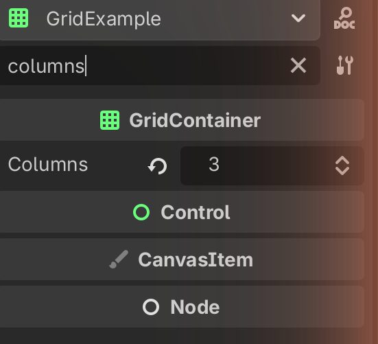
The Inspector filter. At the top of the Inspector is a Filter Properties
search box. Type part of a property name and the list shrinks to matches.
Looking for the columns setting? Select the GridContainer and type columns.
Looking for spacing? Type separation.
Size flags (for children in containers). When a Control is inside a container, it has size flags instead of anchors. The two you need:
- Fill — the child fills the space the container gives it.
- Expand — the child grabs extra space, pushing others aside. Turn Expand on for the field that should stretch (e.g. a wide text box), off for fixed buttons.
You will find these in the Inspector under the child's Layout → Container Sizing section (Horizontal and Vertical).
Properties you will set most often:
| Node | Property | Does |
|---|---|---|
| Label / Button | Text | the words shown |
| GridContainer | Columns | how many across |
| any container | Theme Overrides → separation | gap between children |
| MarginContainer | Theme Overrides → margin | padding inside |
| child in container | Layout → Container Sizing (Fill/Expand) | how it shares space |
✓ Check you can do this
You can use the Inspector filter to jump to a property by name, and you know that a child in a container uses size flags (Fill / Expand) instead of anchors.
1.6 — Reading other tutorials and the Godot docs
This is the payoff. You now have the four ideas every external resource assumes. Here is how our C05 vocabulary maps onto the words Godot and YouTube creators actually use — so any tutorial becomes readable.
| You know it as (C05 / this site) | Godot calls it | YouTubers often say |
|---|---|---|
| an interface element / control | a Control node | "a UI node", "a control", "an element" |
| a thing that arranges others | a Container | "a VBox/HBox", "a box", "a layout node" |
| pinning to the parent | an anchor (and offset) | "anchors", "pin it", "margins" (old) |
| a setting on a node | a property in the Inspector | "the settings on the right", "in the inspector" |
| one saved screen | a scene (.tscn) |
"the scene", "the tscn" |
Three decoder rules for any external tutorial:
-
Check the version. If menus look different or they say "margin" where you see "offset", they are on Godot 3. The ideas are the same; the words moved. Prefer tutorials that say Godot 4.
-
Skip the code parts — they are out of scope for a mock-up. The moment a creator says "add a script," "connect a signal,"
func,_ready(), or "now let's make it do…", they have left UI layout and entered behaviour. For your mock-up you only need the parts where they add nodes, drop them in containers, and set properties. Follow those; ignore the rest. -
Free-dragging vs containers — both are valid. Some creators drag nodes to free positions; others use containers. For a feasible, tidy mock-up, prefer containers — they keep the layout aligned and resize cleanly, which is exactly what makes a design look "complete."
Using the official docs. Go to docs.godotengine.org, set the version selector (bottom-left) to 4.x, and read the GUI / UI section ("Size and anchors", "Using Containers", "Control node gallery"). You now have the vocabulary to follow it.
✋ You can stop here — and most students should
You have crossed the independence threshold. You can choose Control nodes, position them with anchors, arrange them with the five containers, find any property in the Inspector, and decode an external tutorial or the docs on your own. That is everything a mock-up needs.
Level 2 (theming) and the worked layouts are optional polish and practice. Level 3 (capturing the image) is the one more thing you need when you are ready to hand in.
Check Your Understanding
-
A tutorial tells you to add a "Sprite2D." Should you use it in your mock-up?
Answer
No. Sprite2D is a Node2D (blue) — a 2D game object. Mock-ups use Control nodes (green) only.
-
You drop a Button inside a VBoxContainer and then can't move it by dragging. Why — and how do you control its size?
Answer
The container controls its children's positions, so dragging is disabled. You control how it shares space with size flags (Fill / Expand) under Layout → Container Sizing, and spacing with the container's separation property.
-
An old video says "set the left margin to 20." What is that called in Godot 4?
Answer
The offset. "Margin" is the Godot 3 word for the gap between an anchor and the node's edge; Godot 4 renames it "offset."
-
You want five band buttons (1-2, 3-4, 5-6, 7-8, 9-10) in a single row. Which container, and what is the alternative if you wanted them to wrap?
Answer
An HBoxContainer for a single row. If you wanted them to wrap onto more than one line, a GridContainer with Columns set.
-
While following a YouTube tutorial, the creator says "now add a script and connect this signal." What do you do, and why?
Answer
Skip it. Scripts and signals are behaviour (code), which is out of scope for a mock-up. Keep only the steps that add nodes, use containers, and set properties.
Image credits
The editor screenshots and diagrams on this page are from the Godot Engine documentation, © Juan Linietsky, Ariel Manzur and the Godot community, licensed CC BY 4.0. Placeholder images will be replaced with screenshots from our own editor.
→ Optional next steps: Level 2 — Theming · Level 3 — Capturing your mock-up · Worked layouts.